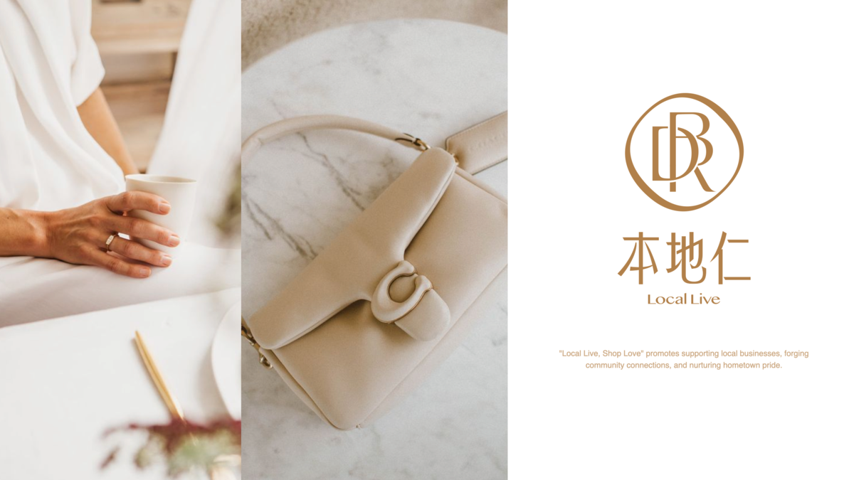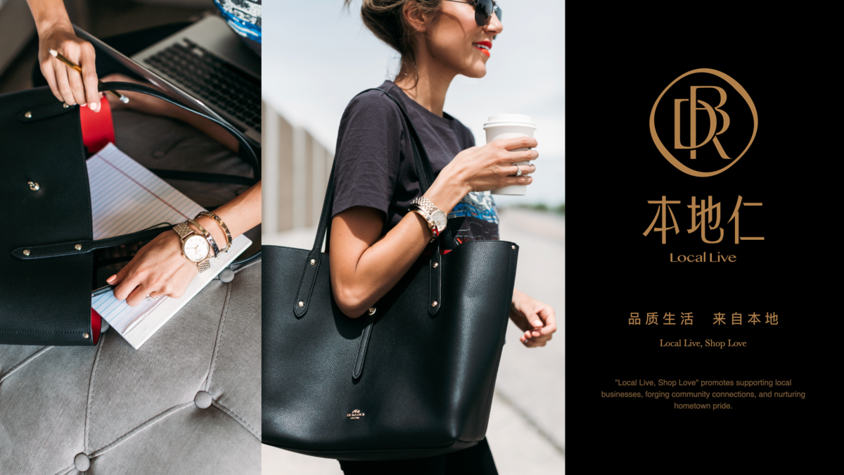

本地仁 - 品质生活,来自本地
Client: 杭州本地仁科技有限公司
Designer: Shan
Scope: 标识设计
Year: 2023
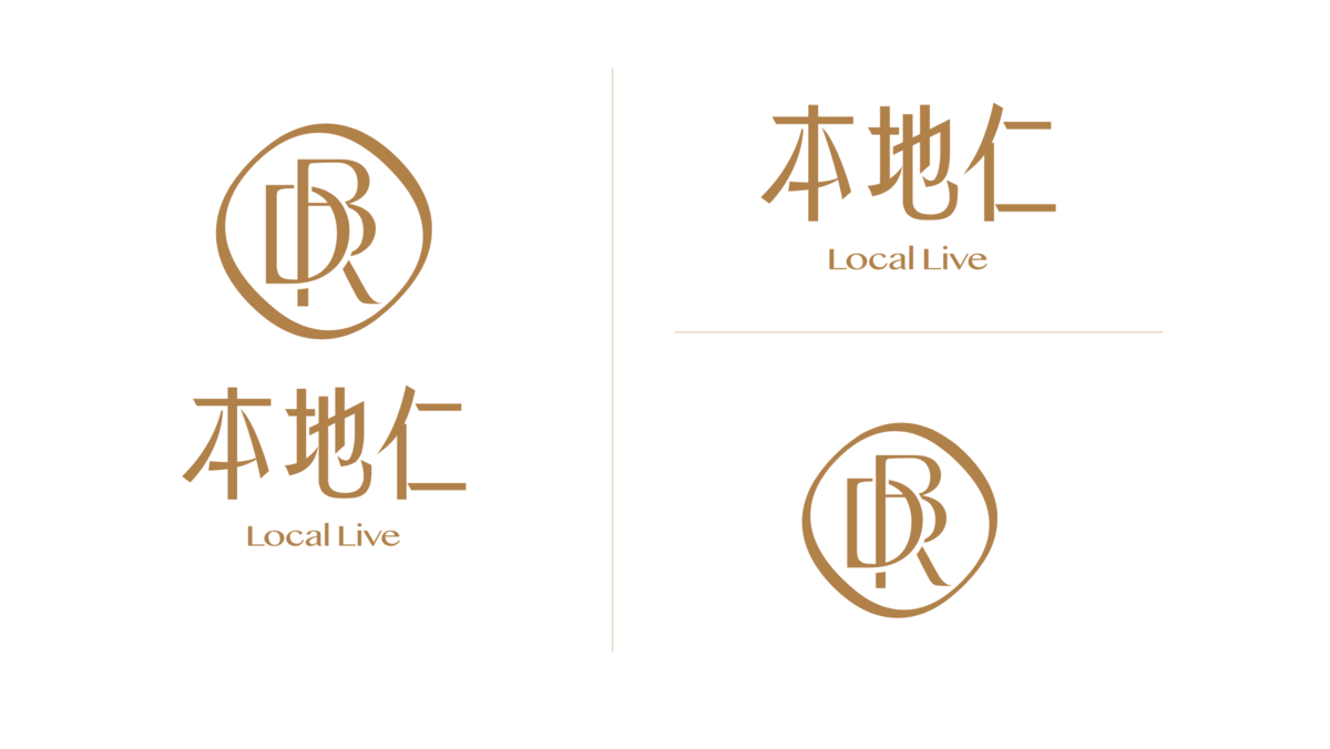
立足轻奢消费赛道,「本地仁」以“品质生活,来自本地”为核心,我们希望将BDR三个字母重构为兼具高奢质感与信赖感的视觉符号。
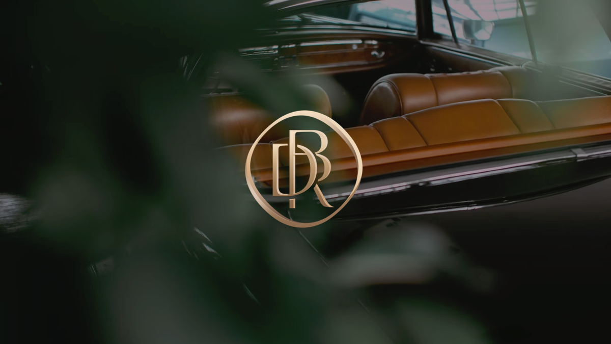
设计以极简几何美学为基调,采用立体金属切割工艺勾勒字母轮廓,三字母通过负空间交叠形成紧密纽带,暗喻平台、品牌与消费者的深度联结。主色调选用淡金色与深空灰碰撞,既延续奢侈品的经典格调,又注入现代科技感。整体图形在手机屏幕与出街物料等场景中均保持高识别度,强化“指尖触碰奢华”的品牌承诺。
我们希望标识通过克制的设计语言构建信任场域:金属质感传递价值感,精密结构彰显专业度,流动光影唤醒消费欲望,最终形成“足不出户,坐拥全球精粹”的视觉承诺,精准锚定高端用户对品质与便捷的双重期待。
The local live streaming platform focuses on high-end lifestyle brands that represent a touch of luxury. It traces the origins of the brands, combining local consumption with live-streaming to maximize convenience for consumers.